Helping people with hemophilia take small steps toward better joint health through accessible, everyday movement
Project overview
Hemophilia patients often face challenges staying consistent with joint health and physical activity. While movement is critical for long-term health, it can feel intimidating, unclear, or difficult to maintain without the right guidance and support.
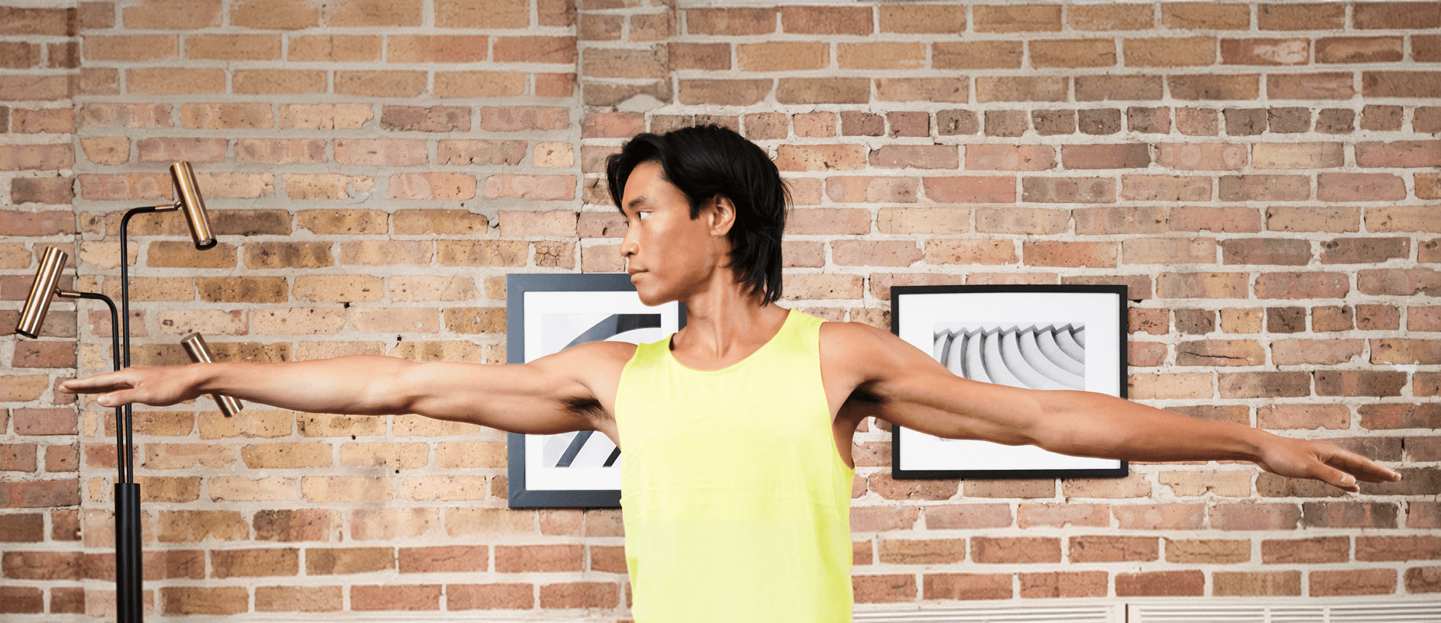
The Joint Movement was designed to encourage healthier lifestyles by making joint care more approachable and actionable. The goal was to create an experience that helps people better understand their bodies, feel more confident in movement, and take small, meaningful steps toward improved joint health.
My role
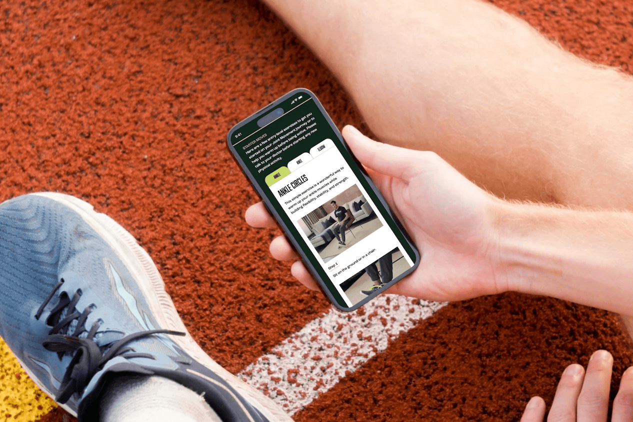
Designed one page responsive website, working closely with cross-functional partners across design, content, and development. The focus was on translating complex health information into clear, engaging interactions that support behavior change over time.
Challenges
The challenge wasn’t awareness—it was action. Patients often understand the importance of movement, but struggle to translate that understanding into consistent behavior. Information around joint health can feel overwhelming or overly clinical, making it difficult to engage with on a regular basis. We needed to design an experience that reduced friction and made movement feel approachable, not intimidating. This meant balancing education with simplicity, while creating a system that encourages small, repeatable actions rather than one-time engagement. At the same time, the experience had to support a wide range of users with different levels of familiarity, confidence, and physical ability—ensuring accessibility without sacrificing clarity or depth.


Results
By enabling users to use the navigation as jump links, and get them to the information they want. The engaging system that made joint health more approachable and easier to act on. Patients were better able to understand key concepts and translate that understanding into small, meaningful actions.
Patients reported feeling more confident in their ability to manage their joint health, with a better understanding of how movement fits into their daily lives. The use of bold visuals and storytelling helped make the experience feel more motivating and less clinical. Over time, the platform evolved from a static information source into an interactive experience that encourages users to engage, participate, and build healthier habits.
What I learned
This project taught me that behavior change doesn’t come from information alone—it comes from making action feel possible. Designing for movement required shifting from simply educating users to actively supporting them. Small, repeatable interactions proved more impactful than large, one-time actions. I learned how important it is to meet users where they are—creating experiences that feel approachable, motivating, and easy to return to. By reducing friction and focusing on clarity, design can help turn intention into action.

Helping people with hemophilia take small steps toward better joint health through accessible, everyday movement
Project overview
Hemophilia patients often face challenges staying consistent with joint health and physical activity. While movement is critical for long-term health, it can feel intimidating, unclear, or difficult to maintain without the right guidance and support.
The Joint Movement was designed to encourage healthier lifestyles by making joint care more approachable and actionable. The goal was to create an experience that helps people better understand their bodies, feel more confident in movement, and take small, meaningful steps toward improved joint health.
My role
Designed one page responsive website, working closely with cross-functional partners across design, content, and development. The focus was on translating complex health information into clear, engaging interactions that support behavior change over time.
Challenges
The challenge wasn’t awareness—it was action. Patients often understand the importance of movement, but struggle to translate that understanding into consistent behavior. Information around joint health can feel overwhelming or overly clinical, making it difficult to engage with on a regular basis. We needed to design an experience that reduced friction and made movement feel approachable, not intimidating. This meant balancing education with simplicity, while creating a system that encourages small, repeatable actions rather than one-time engagement. At the same time, the experience had to support a wide range of users with different levels of familiarity, confidence, and physical ability—ensuring accessibility without sacrificing clarity or depth.
Results
By enabling users to use the navigation as jump links, and get them to the information they want. The engaging system that made joint health more approachable and easier to act on. Patients were better able to understand key concepts and translate that understanding into small, meaningful actions.
Patients reported feeling more confident in their ability to manage their joint health, with a better understanding of how movement fits into their daily lives. The use of bold visuals and storytelling helped make the experience feel more motivating and less clinical. Over time, the platform evolved from a static information source into an interactive experience that encourages users to engage, participate, and build healthier habits.
What I learned
This project taught me that behavior change doesn’t come from information alone—it comes from making action feel possible. Designing for movement required shifting from simply educating users to actively supporting them. Small, repeatable interactions proved more impactful than large, one-time actions. I learned how important it is to meet users where they are—creating experiences that feel approachable, motivating, and easy to return to. By reducing friction and focusing on clarity, design can help turn intention into action.