Introducing HOKA’s sole, and the feeling of flight, to a global audience

Project overview
HOKA’s Fly Human Fly campaign marked the brand’s first global campaign—an opportunity to introduce its identity and products to a worldwide audience. The experience centered around the launch of key product lines, including Mafate and Clifton, requiring digital touchpoints that could clearly communicate performance, energy, and product differentiation at scale. I focused on designing hero experiences that introduce these products, invite users into the brand, and create strong first impressions across HOKA.com. Working closely with cross-functional partners, the goal was to translate campaign storytelling into clear, engaging entry points that balance brand expression with product clarity and usability.
My role
I designed hero sections and key landing moments across HOKA.com, supporting the global rollout of the Fly Human Fly campaign and the introduction of the Mafate and Clifton product lines. My work focused on shaping first impressions—using layout, typography, and visual hierarchy to highlight key products, communicate performance attributes, and guide users into deeper product exploration. I collaborated closely with design, content, and development teams to ensure consistency across campaign touchpoints and responsiveness across devices.
Challenges
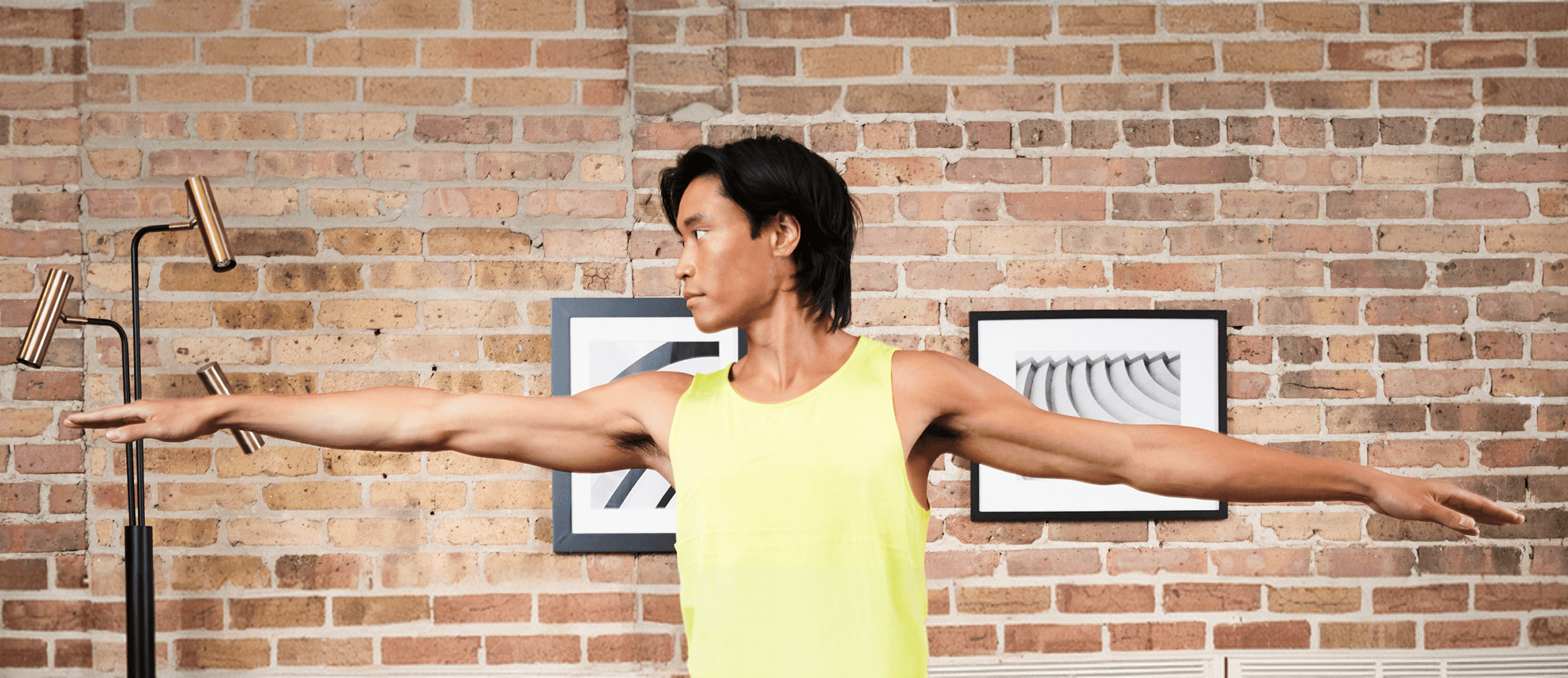
The challenge wasn’t just visual—it was about introducing both a brand and its products at a global scale. As HOKA’s first global campaign, Fly Human Fly needed to communicate more than features—it needed to convey a feeling. There was an opportunity to connect the sole of the shoe to the soul of the brand, bringing movement, performance, and identity into the very first interaction. At the same time, the experience had to remain clear and navigable. Hero sections needed to balance bold, high-energy visuals with structured information—helping users quickly understand the differences between Mafate and Clifton while guiding them seamlessly into deeper product pages.


Results
The final experience created clear, engaging entry points that supported the global launch of HOKA’s Mafate and Clifton product lines. Hero designs helped users quickly understand key product differences while maintaining the energy of the Fly Human Fly campaign. Structured layouts and strong visual hierarchy improved clarity, guiding users from inspiration into product exploration. We used HOKA’s bird logo as a visual medium to evoke movement and motion—turning it into a symbol of how the product feels. Gradients reinforced this sense of progression, reflecting the journey of runners at every level and creating a continuous, forward-moving experience. Together, these elements strengthened the connection between brand and experience, helping users associate HOKA with the sensation of movement and flight. The result was a more cohesive and engaging first impression across digital touchpoints.
What I learned
This project reinforced that strong brand experiences come from balancing expression with clarity. Through iteration, I learned how to design hero moments that feel dynamic while still helping users quickly understand products like Bondi 8 and Mafate. Working closely with designers and stakeholders emphasized the importance of alignment. Establishing a shared visual direction ensured the campaign felt cohesive across touchpoints, even as designs adapted across products. It also deepened my understanding of systems thinking in brand work. Defining patterns for motion, layout, and visual elements like gradients and logo usage made it possible to scale the experience consistently while keeping each interaction connected.
Latest projects
Introducing HOKA’s sole, and the feeling of flight, to a global audience
Project overview
HOKA’s Fly Human Fly campaign marked the brand’s first global campaign—an opportunity to introduce its identity and products to a worldwide audience. The experience centered around the launch of key product lines, including Mafate and Clifton, requiring digital touchpoints that could clearly communicate performance, energy, and product differentiation at scale. I focused on designing hero experiences that introduce these products, invite users into the brand, and create strong first impressions across HOKA.com. Working closely with cross-functional partners, the goal was to translate campaign storytelling into clear, engaging entry points that balance brand expression with product clarity and usability.
My role
I designed hero sections and key landing moments across HOKA.com, supporting the global rollout of the Fly Human Fly campaign and the introduction of the Mafate and Clifton product lines. My work focused on shaping first impressions—using layout, typography, and visual hierarchy to highlight key products, communicate performance attributes, and guide users into deeper product exploration. I collaborated closely with design, content, and development teams to ensure consistency across campaign touchpoints and responsiveness across devices.
Challenges
The challenge wasn’t just visual—it was about introducing both a brand and its products at a global scale. As HOKA’s first global campaign, Fly Human Fly needed to communicate more than features—it needed to convey a feeling. There was an opportunity to connect the sole of the shoe to the soul of the brand, bringing movement, performance, and identity into the very first interaction. At the same time, the experience had to remain clear and navigable. Hero sections needed to balance bold, high-energy visuals with structured information—helping users quickly understand the differences between Mafate and Clifton while guiding them seamlessly into deeper product pages.
Results
The final experience created clear, engaging entry points that supported the global launch of HOKA’s Mafate and Clifton product lines. Hero designs helped users quickly understand key product differences while maintaining the energy of the Fly Human Fly campaign. Structured layouts and strong visual hierarchy improved clarity, guiding users from inspiration into product exploration. We used HOKA’s bird logo as a visual medium to evoke movement and motion—turning it into a symbol of how the product feels. Gradients reinforced this sense of progression, reflecting the journey of runners at every level and creating a continuous, forward-moving experience. Together, these elements strengthened the connection between brand and experience, helping users associate HOKA with the sensation of movement and flight. The result was a more cohesive and engaging first impression across digital touchpoints.
What I learned
This project reinforced that strong brand experiences come from balancing expression with clarity. Through iteration, I learned how to design hero moments that feel dynamic while still helping users quickly understand products like Bondi 8 and Mafate. Working closely with designers and stakeholders emphasized the importance of alignment. Establishing a shared visual direction ensured the campaign felt cohesive across touchpoints, even as designs adapted across products. It also deepened my understanding of systems thinking in brand work. Defining patterns for motion, layout, and visual elements like gradients and logo usage made it possible to scale the experience consistently while keeping each interaction connected.